

BRANDING · PACKAGING
There’s a phenomenon that happens in Broome.
Travellers and locals unite on Broome-time to watch the moon staircase across the tides. They celebrate the unique occasion and location in unity.
The spirit of The Kimberley.

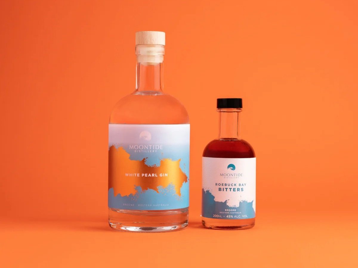
The Moontide team required a complete branding package including the naming, identity and structure of the brand.
The name pays homage to the Staircase to the Moon and the Monsoonal Rainwater which is used for distillation. The aim was to create a mark that is just as powerful and memorable without the name.


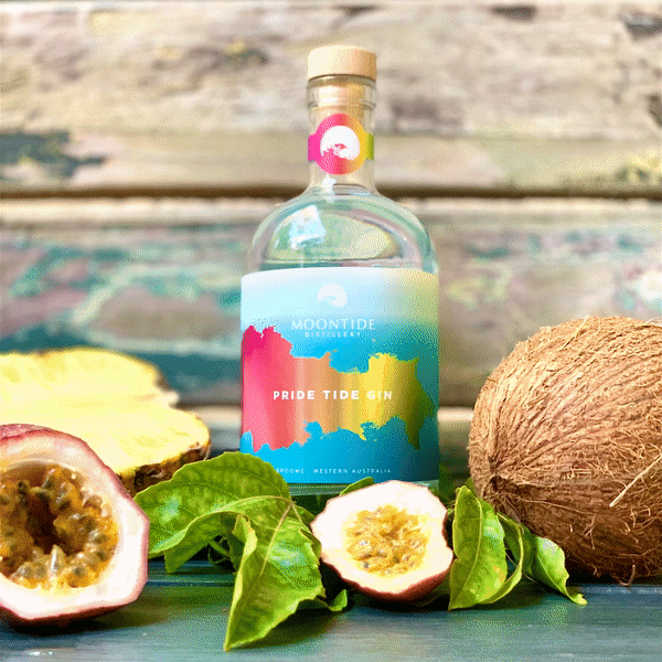
Broome is a place of natural beauty, energy and colour, the Moontide colour palette is inspired by the vibrant Kimberley landscape, featuring striking Rugged Pindan, Milky Turquoise Blue and the Lunar Teal.